eversea yacht society
luxury lifestyle club
Designing a cohesive brand identity for a private members club, where lifestyle, access and visual expression operate as one.
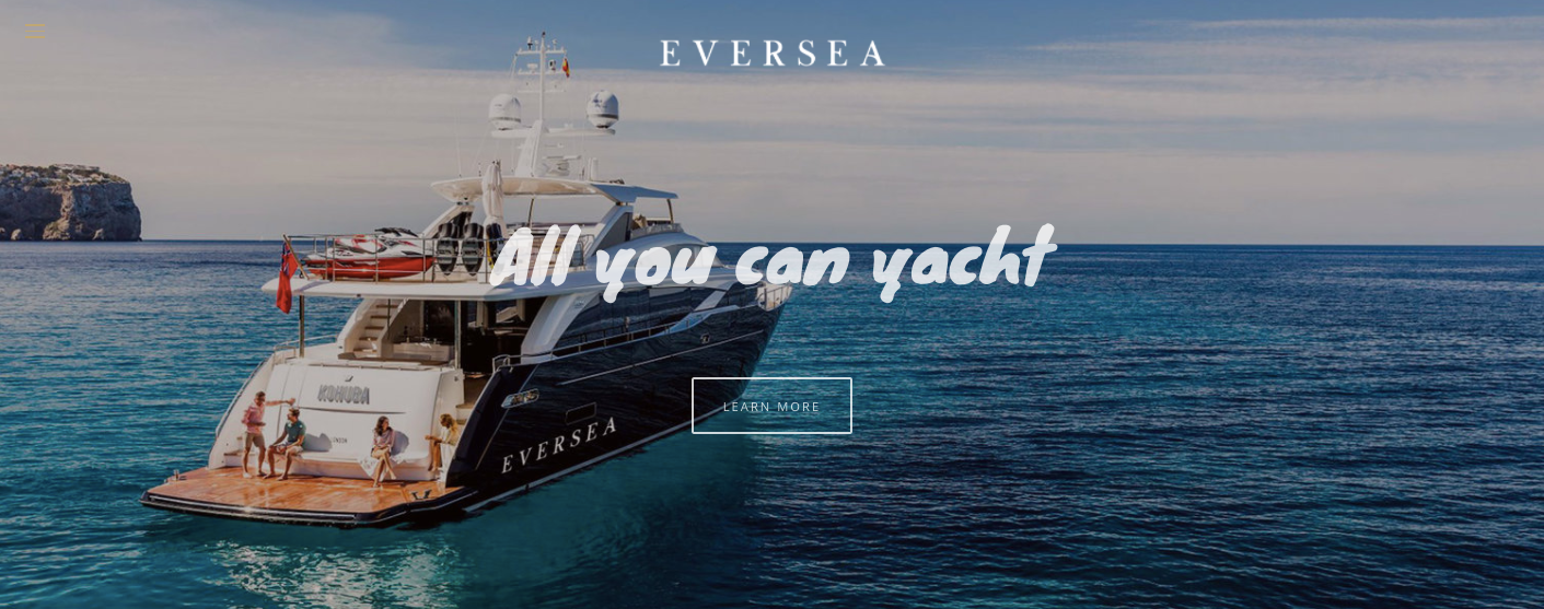
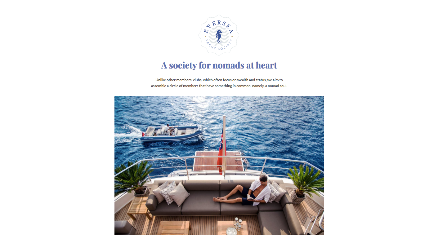
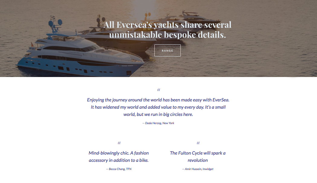
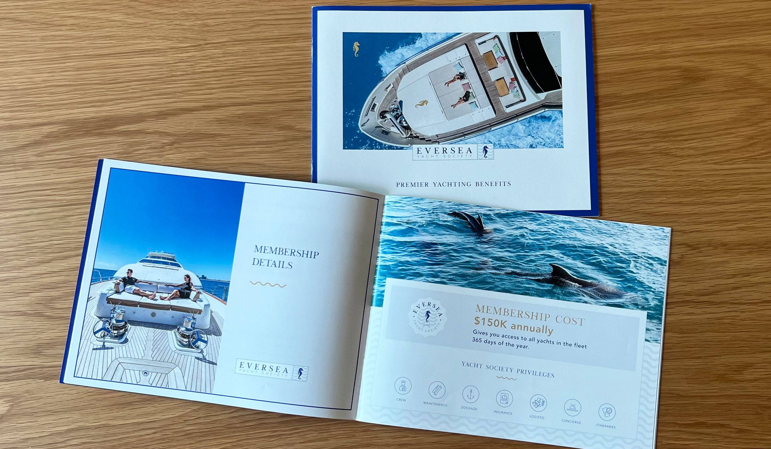
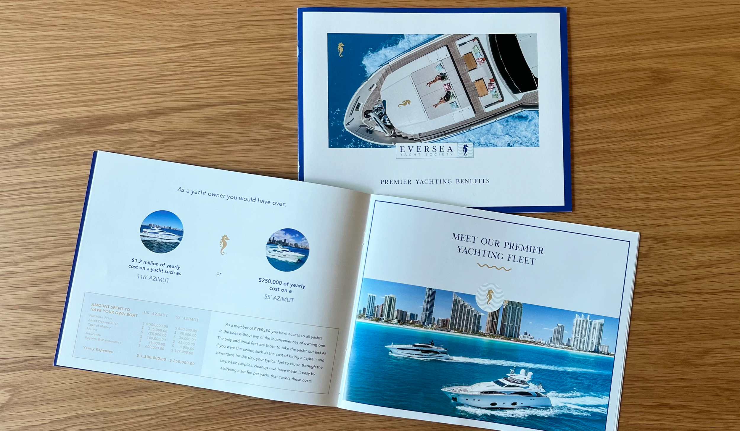
Eversea Yacht Society is a private lifestyle club centered on yachting culture, access and curated experiences. A luxury lifestyle club built around private access and curated moments, it required a cohesive identity that reflected exclusivity and lifestyle. The work included full brand development, creating the identity, the visual systems and the brand touchpoints that hold consistency across every expression.
The brief was a cohesive identity. The real problem was that a private club has to sell belonging before it has any members.
A new club faces a condition most brands never do. It offers access to a world that does not yet exist, and membership in a community that has not yet formed. There is no social proof to borrow, no room already full of the right people. Everything the club is has to be carried by the brand first. On top of that, yachting is one of the most visually saturated territories in luxury, where the same signals of navy, rope and gold repeat until most brands in it read as versions of one another. Cohesion alone would have produced something competent and interchangeable. The identity had to make Eversea feel like an established world, selective and specific, on the day it opened, before a single member could confirm it was.
So the work did not begin with a logo. It began with what the club actually believes: that access and identity are the same thing, that belonging here is a way of seeing rather than a tier of spend. That conviction became the spine of the system, and every element expressed it rather than decorating it. The identity, the visual language and the touchpoints were built as one continuous voice, so that an invitation, a screen and a room all transmit the same felt sense of exclusivity. The palette holds the natural language of the sea, navy and a measure of gold, but treated with restraint, so it reads as refined and particular to Eversea rather than as the expected nautical signal. Distinction came from how the familiar was handled, not from reaching for something louder.
What this produced is a brand that could stand as a world before it had a population. Eversea could present itself as intentional and selective from the start, giving the right member something coherent to recognize and belong to rather than a new venture asking to be trusted. Consistency across every touchpoint meant the club read as already itself, which is the quality that makes belonging feel earned rather than sold.
For a new members brand, identity is not decoration applied to a community. It is the proof of a world that lets the community form. A club sells belonging before it has members. The brand is what makes belonging believable first.


WEBSITE DESIGN: