suvinil
consumer brand
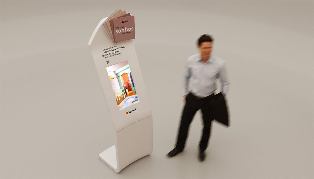
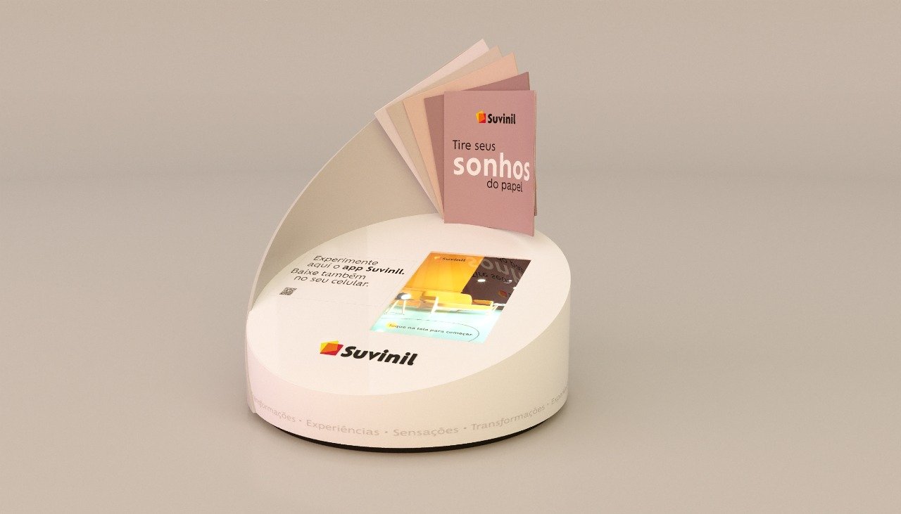
Translating a season's new color range into a physical, interactive pop-up, where product, space and audience meet as one experience.
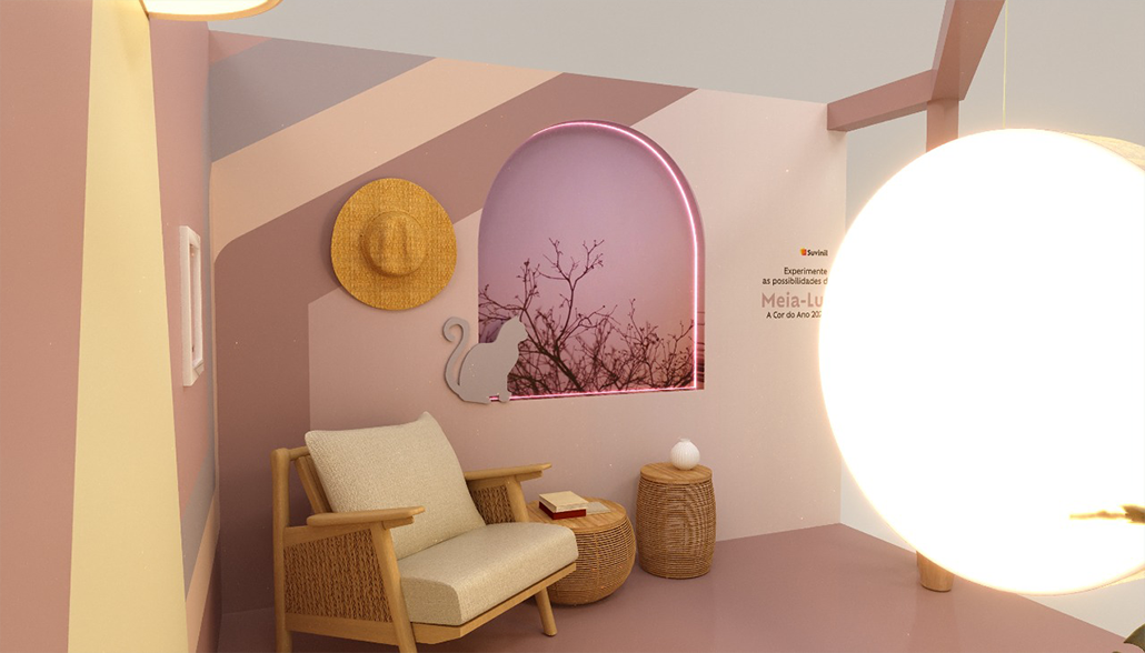
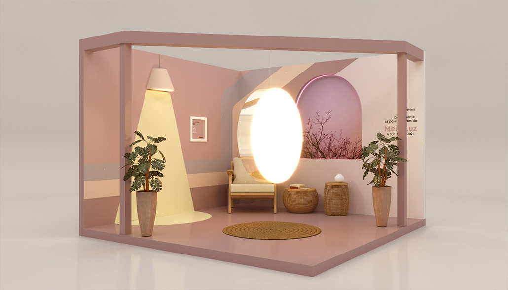
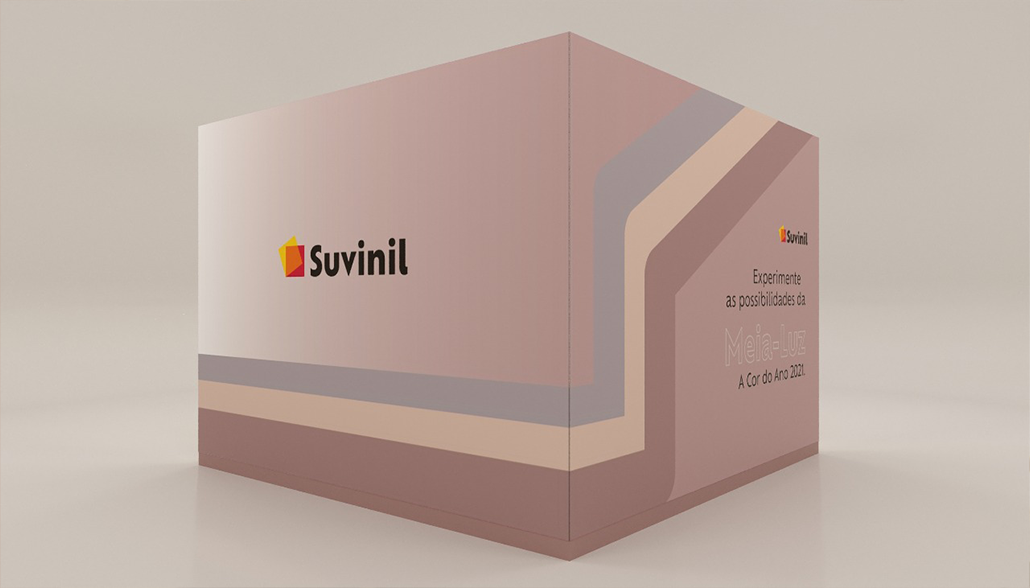
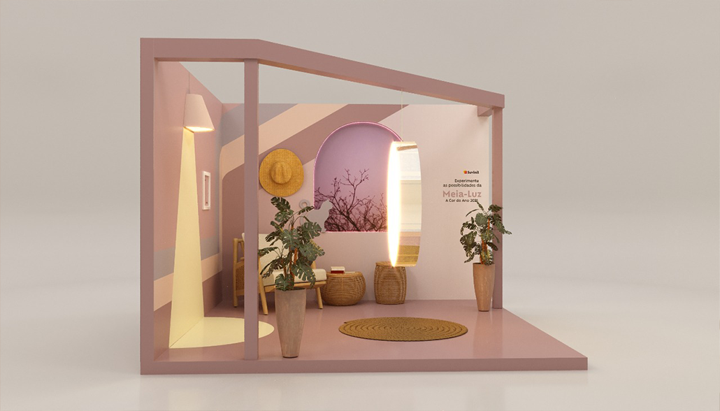
Suvinil is a color brand whose new-season palette is the product. The brief was clear: bring the season's new colors to its audience in a way that traditional communication channels could not. The work was creative direction for a temporary brand environment, covering the pop-up concept, the spatial design and the visual elements that carried it. The result had to hold as one coherent expression across product, space and the people moving through it.
The reading beneath the brief was simple and it set the whole direction. New colors can be shown, or they can be experienced. A wall of swatches informs. It does not stay with anyone. Color, more than almost any brand asset, is understood through encounter: the way it fills a room, sits beside another tone, changes as the light moves. So the question was never how to display the season. It was how to build a place the season could be felt inside, where the audience did not look at the colors but stood among them.
The intervention answered that question spatially. The pop-up was not a showroom for a palette. It was the palette, made into an environment the audience entered and moved through. Every visual element, from the surfaces to the sequence of the space, was directed to keep one thing intact: that brand communication, product and audience read as a single experience rather than three separate things placed near each other. The space did the work the channels could not, turning a message about color into a direct, physical encounter with it.
What it produced was a shift in register. The season stopped being something Suvinil announced and became something its audience spent time inside. Communication moved out of the feed and the frame and into a room the brand could hold, where attention was not competed for but given, because there was something real to stand in. The connection was direct, and it belonged to the brand in a way a campaign asset never fully does.
The principle the engagement proved carries past this one project. A brand that builds a place its audience can walk into is remembered differently from one that is only seen. For color especially, the room is the message. When communication becomes an environment, the audience stops receiving it and starts remembering it.